A brand identity checklist for businesses starting from zero
A brand is not a logo. It is the set of decisions that makes everything you put out look and sound like it came from the same business. If you are starting from zero, no brand guide, no social accounts, no packaging, this checklist is the order we recommend.
1. Know who it is for and how it should feel
Before opening any design tool, write three lines:
- Who is the customer?
- What are they trying to do or feel?
- Which three words describe how the brand should feel? (For example: calm, premium, honest.)
Every later choice, colour, font and tone of voice, should pass this test.
2. Choose the name and check it
Search the name on Google, on your target social platforms and in your country's trademark register. A great name that is already taken on Instagram, or too close to an established brand, becomes a long-term headache. Check the domain too.
3. Design a logo that works small
A logo must work as a tiny avatar and on a label. Aim for:
- A wordmark first. Your name set in a distinctive typeface is often stronger than a complicated symbol.
- A simple icon or mark that can stand alone on a social profile.
- One-colour and reversed versions for dark backgrounds.
Test it at the size of a thumbnail. If you cannot read it, simplify.
4. Pick a small colour system
Three to five colours is plenty:
- A main brand colour
- A dark neutral for text
- A light neutral for backgrounds
- One or two accents, used sparingly
Write down the exact hex values so every designer, printer and website uses the same ones. Check that text on each background is readable.
5. Choose two typefaces
One for headlines, one for body text. Pairing a characterful display face with a quiet, readable sans-serif works almost every time. Use licensed or open-licence fonts and note the weights you use.
6. Define the voice
Decide how the brand talks. Short or long sentences? Playful or serious? Write five sample lines, a greeting, a product description, an apology, a sale announcement and a thank-you. Anyone writing for you can copy the pattern.
7. Design the physical and digital basics
- Packaging and labels, with legal information such as ingredients, volume and batch details planned into the layout from the start
- Social profile pictures and a post template so your feed looks consistent
- Business card and email signature
- A simple website with your colours, type and logo applied the same way
8. Make a one-page brand board
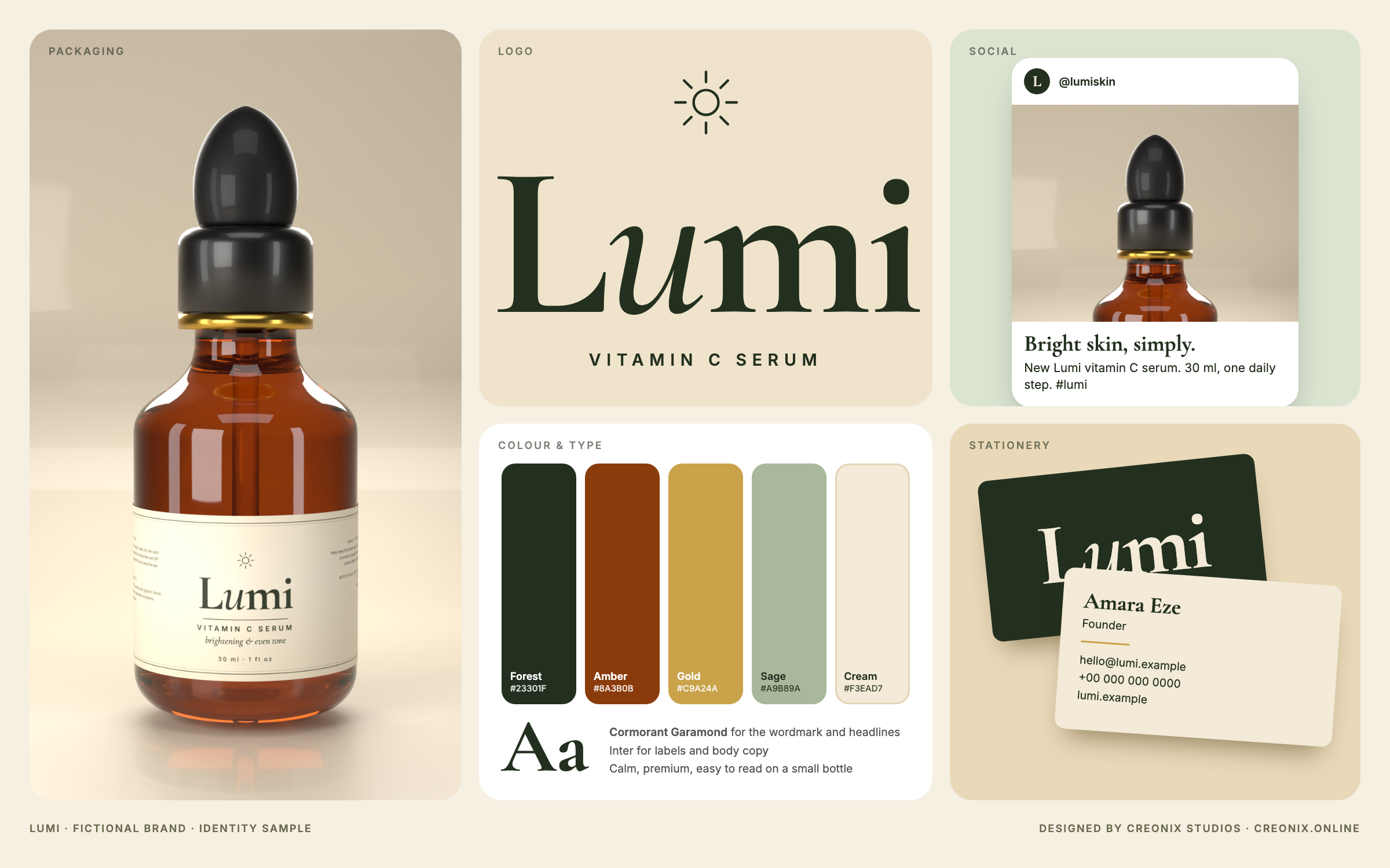
Put the logo, colours, fonts, a sample label and a sample social post on one page. It is the fastest way to brief a designer, a printer or a freelancer, and the fastest way to spot inconsistencies. You can see two examples on our brand identity section: Lumi, a skincare brand, and Zing, a drinks brand. Both are fictional samples.
9. Test it in context
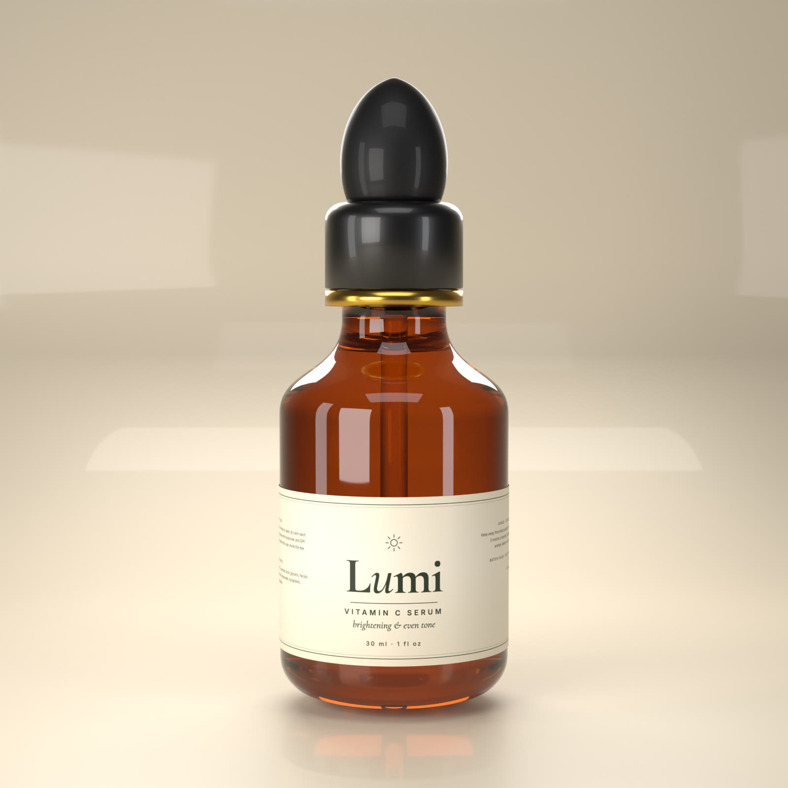
Mock the brand up where it will actually live: on a bottle in your hand, on a phone screen, on a shelf next to competitors. 3D product renders are a good way to see packaging before you commit to printing.
Common mistakes
- Too many colours or fonts
- A logo that only works large
- Copying a competitor too closely
- Ignoring legal text until the label is finished
- Skipping the board, so each new asset drifts
A sensible order and budget
If money is tight, do the work in this order: name, logo, colours and fonts, brand board, then packaging, then social templates. Do not commission a website or animation before the basics exist, or you will pay to redo them.
If you want help, we design brand identities and then bring them to life with 2D explainers and 3D. Start a project.
Want this made for you?
Creonix Studios makes 2D explainers, storyboards, 3D characters and product renders.
Start a project →